THE PROCESS
Our first step as Lexington’s club was to listen to the people of Lexington. We conducted 14 listening sessions. We received over 300 brand surveys and nearly 1500 stadium surveys. In total, we listened for over 80 hours and conducted more than 200 hours of research.
The message is clear. We are proud of our winning tradition. And, we are proud of the landscape that nurtures our signature industries: bourbon and horses.
Visual identity designed by renowned soccer brand designer Christopher Payne.
HORSE
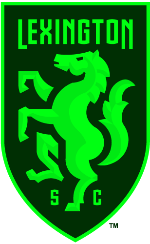
Horses are synonymous with Lexington, the horse capital of the world. People speak with pride about the majestic, athletic, powerful animal. The design of our horse is distinct yet traditional. Rearing upward gives the crest a sense of energy and power, striking a balance of historical and contemporary.
SHIELD
The shield reflects the longstanding traditions of soccer. The heraldic silhouette recalls soccer club crests from the sport’s early days during the Victorian era. And the tapered shape perfectly frames our horse and our name.
TYPOGRAPHY
Our name, Lexington Sporting Club, is emblazoned in typography inspired by bourbon barrels. The letters are reminiscent of the barrels' graceful curves, giving our name the weight of local history and tradition.
OUR COLORS
Lexington’s rolling hills and lush, leafy woodland that bolster Kentucky's major industries — bourbon and horses — inspire the colors for this design. Our community carries a strong sense of place, and we love the memorable green colors that dominate our landscape.


